Explore Missions: Off The Wall
-
 The President's Choice
-
 Red Horizon
-
 The Mill and the Mountain
-
 Angel of Death
-
 War Paint
-
 West
West
-
 The Zone
-
 BAD
BAD
-
 Hunting Season
-
 Left for Dead
-
 Six Months
-
 Wolfcop
-
 Transmission
-
 El Diablo
-
 Doll Face
-
 Life of a Locksmith
-
 Rabbit
-
 Hastings Street
-
 Dany Boy
-
 Uprising
-
 Deadly Measures
-
 Til the End of the Day
-
 The Dangers of Online Dating
-
 Ivy Tower
-
 How To Bite a Zombie
-
 Post-Apocalyptica
-
 Causeway
-
 The Last Video Store
-
 Third Wave Film
-
 The B Side
-
 Lake Cop: Ripple Effect
-
 AutoScript
-
 Alpha Bet
-
 Long Distance
-
 Starkers
-
 Mr. Tom
-
 The Link
-
 Donde Esta Guillermo
-
 Ashton Parker is Dead
-
 Rosalind Revenge
-
 SCAM
SCAM
-
 Sapience: The Search for Wisdom
-
 Longyear
-
 Memoria
-
 Grade Nine
-
 The Fall
-
 Stream
-
 Heart Cooks Brain
-
 Panic and Run
-
 Contained
-
 Kazam
Kazam
-
 An Open Door
-
 Black Haze
-
 The Pineville Heist
-
 Alien Abduction
-
 Orangutan Guerillas
-
 Prom Night of The Living Dead
-
 Slay to Rest
-
 Project Sarah
-
 Tumbling After
-
 Ascendant
-
 Porn School
-
 The Harvest Project: Absolution
-
 Van Gore
-
 Ruby Starfish
-
 The Next Morning
-
 Interstate 90
-
 Gillian's Just Right
-
 Dark 4Rest
-
 The Arrangement
-
 The Never Man
-
 Rock Bottom
-
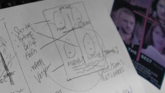 The Sect


Posted 5 months ago
Posted 5 months ago
Posted 5 months ago
Posted 6 months ago
Posted 6 months ago
Posted 6 months ago
Posted 6 months ago
Posted 6 months ago
Posted 6 months ago
Posted 6 months ago
Posted 6 months ago
Posted 6 months ago
Posted 6 months ago
Posted 6 months ago
Posted 6 months ago
Posted 7 months ago
Posted 6 months ago
Posted 7 months ago
Posted 7 months ago
Posted 7 months ago
Posted 7 months ago
Posted 7 months ago
Posted 7 months ago
Posted 7 months ago
Posted 7 months ago
Posted 7 months ago
Posted 7 months ago
Posted 7 months ago
Posted 7 months ago
Posted 7 months ago
Posted 7 months ago
Posted 7 months ago
Posted 7 months ago
Posted 7 months ago
Posted 7 months ago
Posted 7 months ago
Posted 7 months ago
Posted 7 months ago
Posted 7 months ago
Posted 7 months ago
Posted 7 months ago
Posted 7 months ago
Posted 7 months ago
Posted 7 months ago
Posted 7 months ago
Posted 7 months ago
Posted 7 months ago
Posted 7 months ago
Posted 7 months ago
Posted 7 months ago
Posted 7 months ago
Posted 7 months ago
Posted 7 months ago
Posted 7 months ago
Posted 7 months ago
Posted 7 months ago
Posted 7 months ago
Posted 7 months ago
Posted 7 months ago
Posted 7 months ago
Posted 7 months ago
Posted 7 months ago
Posted 7 months ago
Posted 7 months ago
Posted 7 months ago
Posted 7 months ago
Posted 7 months ago
Posted 7 months ago
Posted 7 months ago
Posted 7 months ago
Posted 7 months ago